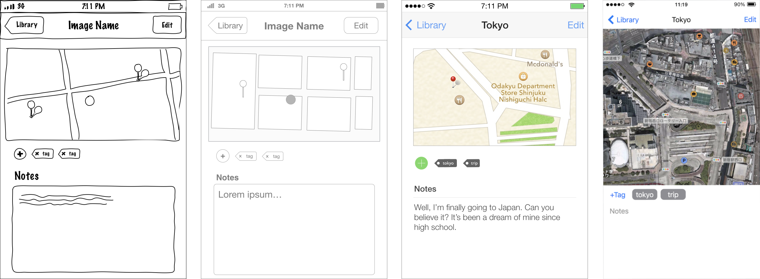
Compare and contrast different design artefacts (sketch, wireframe, mockup, and prototype) in terms of their fidelity, speed, cost and use cases.
💭 UI/UX design artefacts
Comparison of sketch, wireframe, mockup, and prototype

Because this seems to keep popping up in my discussions from time to time:
| Artefacts | Fidelity | Speed | Cost |
|---|---|---|---|
| Sketch | ➖➖ very low | ➕➕ very fast | 💲 cheap |
| Wireframe | ➖ low | ➕ fast | 💲💲 low |
| Mockup | ➕ medium | ➖ slow | 💲💲💲 high |
| Prototype | ➕➕ high | ➖➖ very slow | 💲💲💲💲 expensive |
Sketch — pen & paper rough drawings
- Quick brainstorm of ideias
- Easy communication of purpose
Wireframe — black & grey representation
- Use: quick communication of interactions
- Documenting the interface;
Mockup — static coloured visualisation
- Gather rough feedback and buy-in from stakeholders
Prototype — real interactive implementation
- User testing in a scenario close to reality
- Possibly reusable into the product
See also,