The goal is to apply “inbox zero” concepts to Slack and mitigate the pressures to “respond immediately”. The realisation is that sections can become a pseudo-inbox of channels that need reading (as opposed to considering messages the unit to manipulate).
💭 Slack Overload? Regain control with Inbox Zero principles
Get control of your Slack inbox with Inbox Zero principles and enjoy a clutter-free workspace.

“Wide aspect ratio image to illustrate this blog post about techniques to deal with Slack overload of messages, with the following title and subtitle” [with edits] (DALL·E)
Table of Contents
Update 2024-05-08: Finish updating the full setup description according to the new sections format. Also, add a cover image.
Update 2024-04-19: Add illustrative images to the Context section, including info on Rivers, not buckets.
Update 2024-02-13: Introduce headings for easier navigation and highlight the core problem with messaging apps.
Update 2023-10-17: Replace simplistic “Channels/Someday” channel organisation with a MoSCoW-inspired sections structure optimised for fast processing.
Context
Lets start by recalling a few old principles about processing large volumes of information, and then define the core problem with modern messaging apps, as I see it…
📥 Inbox zero

“A black and white sketch image to illustrate the concept of inbox zero” (DALL·E)
“Inbox zero” is a pivotal concept to deal with the constant influx of information of modern life. Merlin Mann coined it in 2006, during a series of posts on 43Folders.
That “zero?” It’s not how many messages are in your inbox–it’s how much of your own brain is in that inbox. Especially when you don’t want it to be. That’s it.
It was not about “perfection” but rather a way for us to take back control of our time and avoid being reactive. To do that, you triage messages to focus on what matters:
- Take fixed times in the day to go through your inboxes — close or ignore them outside of those times
- Make decisions, not actions — triage fast and act later, so you’re not derailed into a long essays
Once you’re done for the time slot, you can get out of that “new/unread” mind space. Go back to doing your actions, according to whichever criteria you think fits best.
At the time, this concept appeared to deal with the problems of overwhelmed email inboxes. Its core principles expand beyond email though. They are essential to get out of a reactivity loop and quite generic that they apply to other areas or our life:
Accept that almost everything in your life is an inbox
— Natasha Bernal on Everything you thought you knew about inbox zero is wrong | WIRED UK (Internet Archive 2024-02-25)
⛲️ Rivers, not buckets
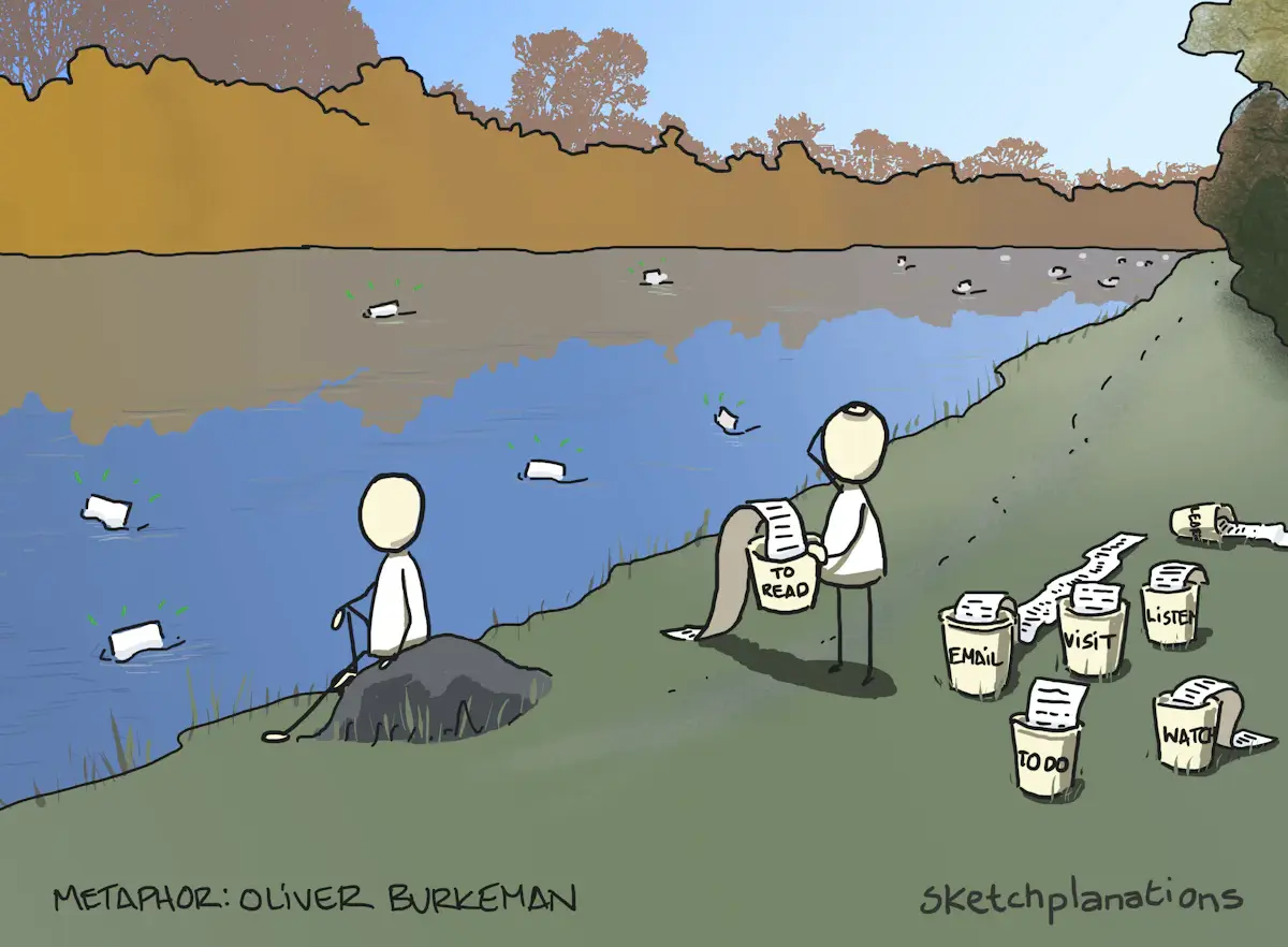
“Instead of a bucket list to get through, try thinking of it as a river where attractive options drift by” (Sketchplanations)
Dave Winer id one of the creators of the RSS specification and a forefather of blogging. He started advocating the concept of a River of News in the early 2000s:
They call them streams, lifestreams, etc, but they’re all the same basic idea. Park yourself on the riverbank and watch the news flow by. If you miss something, not to worry, if it’s important some new story will refer to it.
Since then, the “stream of information” concepts have spread to most online experiences. There’s prime examples in all the social media applications, newspapers, aggregators, etc.
Oliver Burkeman expands on this concept and urges you to treat your to-read pile like a river. In this approach, you cherry-pick the most important things that stand out, and let the other ones drop:
To return to information overload: this means treating your “to read” pile like a river (a stream that flows past you, and from which you pluck a few choice items, here and there) instead of a bucket (which demands that you empty it).
There’s also an underlying need that is worth highlighting, and it might not seem obvious at first sight. We must be able to identify which of the pieces of info floating through are important to us.
💬 Messaging apps problem
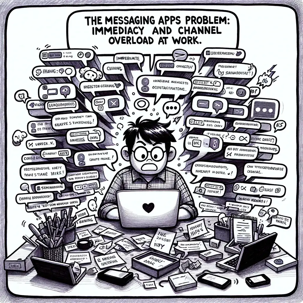
“Illustrate the text in this section in the cartoon-style” (DALL·E)
Nowadays work happens on instant message applications, not email. These types of applications are quite bad in letting us apply the above concepts:
- Their structure revolves around immediacy of synchronous messages and responses
- Their core unit to manipulate is the channel, not individual messages
Slack, in particular, is one of the worst offenders in this matter. Many of of their design decisions reinforce the notion of immediacy and having to “keep up” with it. For example:
- The frequent “X is typing” notices
- The inability to read recent messages and keep older ones unread for later
Solution
⏱️ The gist of the solution
The goal is to apply the “inbox zero” concepts outlined above and mitigate the pressures to “respond immediately”.
The realisation is that sections can become a pseudo-inbox of channels that need reading (as opposed to considering messages the unit to manipulate).
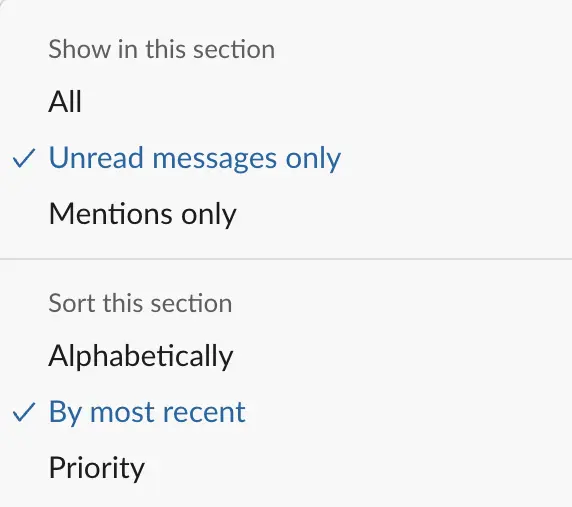
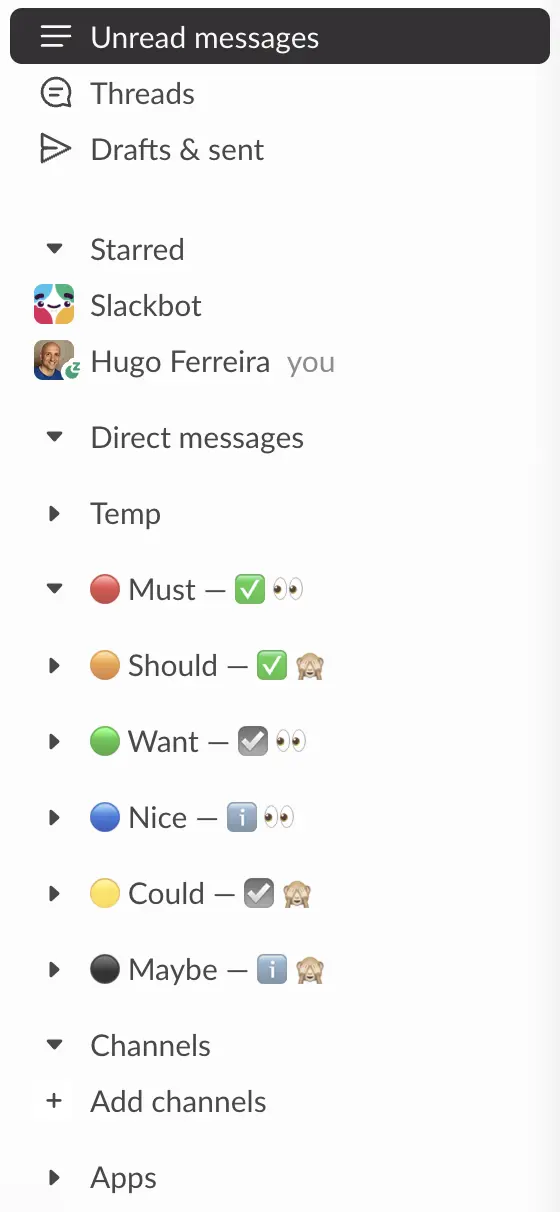
This is how I setup my Slack channels sections to make them behave more like an inbox:
- Show channels with Unread messages only
- Sorted By most recent
🗂️ Organise for fast processing
In practice, the most granular unit you can manage your “unreads” in Slack is the channel, not the message.
Depending on how far back I am with the backlog of messages channels to read, I want to be more flexible to decide where to stop (i.e. I’ve seen what’s important) and “mark all as read” the rest (i.e. “rivers, not buckets”).
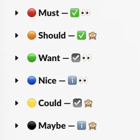
As for which sections to use, I’ve ended up with a MoSCoW-inspired list where I essentially answer the following questions for each channel:
- How directly related to my work/role is it?
- ✅ Yes, very
- ☑️ Meh, kinda
- ℹ️ Not really
- Am I keen on reading/seeing new messages on it?
- 👀 Yes
- 🙈 Nope
The decision matrix for where to save each channel then becomes something like this:
| Directly related to my role? | Am I keen on reading it? | Section | |
|---|---|---|---|
| ✅ Yes | 👀 Yes | ➔ | 🔴 Must |
| ✅ Yes | 🙈 Nope | ➔ | 🟠 Should |
| ☑️ Kinda | 👀 Yes | ➔ | 🟢 Want |
| ☑️ Kinda | 🙈 Nope | ➔ | 🟡 Could |
| ℹ️ Nope | 👀 Yes | ➔ | 🔵 Nice |
| ℹ️ Nope | 🙈 Nope | ➔ | ⚫️ Maybe |
In practice, the order of those sections in Slack changed a little bit over time and now follow what is roughly two sets of “traffic lights”: 🚥
- 🔴 Must, 🟠 Should, 🟢 Want — Allways read, and read regularly
- (if on a very tight time crunch, “Want” might be skipped)
- 🔵 Nice, 🟡 Could, ⚫️ Maybe — Read sproradically, depending on time and energy
- (good candidates for the context menu action “Manage” ➤ “Mark all as read”)
Putting it all together:
This is now the most battle tested setup I have stayed with for many months. Most past setups broke down on the “coming back from holidays” huge backlog of stuff to read.
This setup lets me manage my time/energy more effectively and use the “mark all as read” more often, once the core channels are cleared.
📨 Processing inboxes
With this, my daily process becomes, at specific times during the day:
- Deal with Direct messages
- Check for Threads updates
- Process the updated Channels in the first section 🔴 Must
- Continue to the second section 🟠 Should
- If time permitting, continue going down to the 🟢 Want section
When I have some more relaxed time, usually at the end of the day:
- Skim and cherry-pick from the remaining sactions channels some messages that spark my curiosity
Shift-Escto “mark all as read” and have an clean slate for next day
Tip
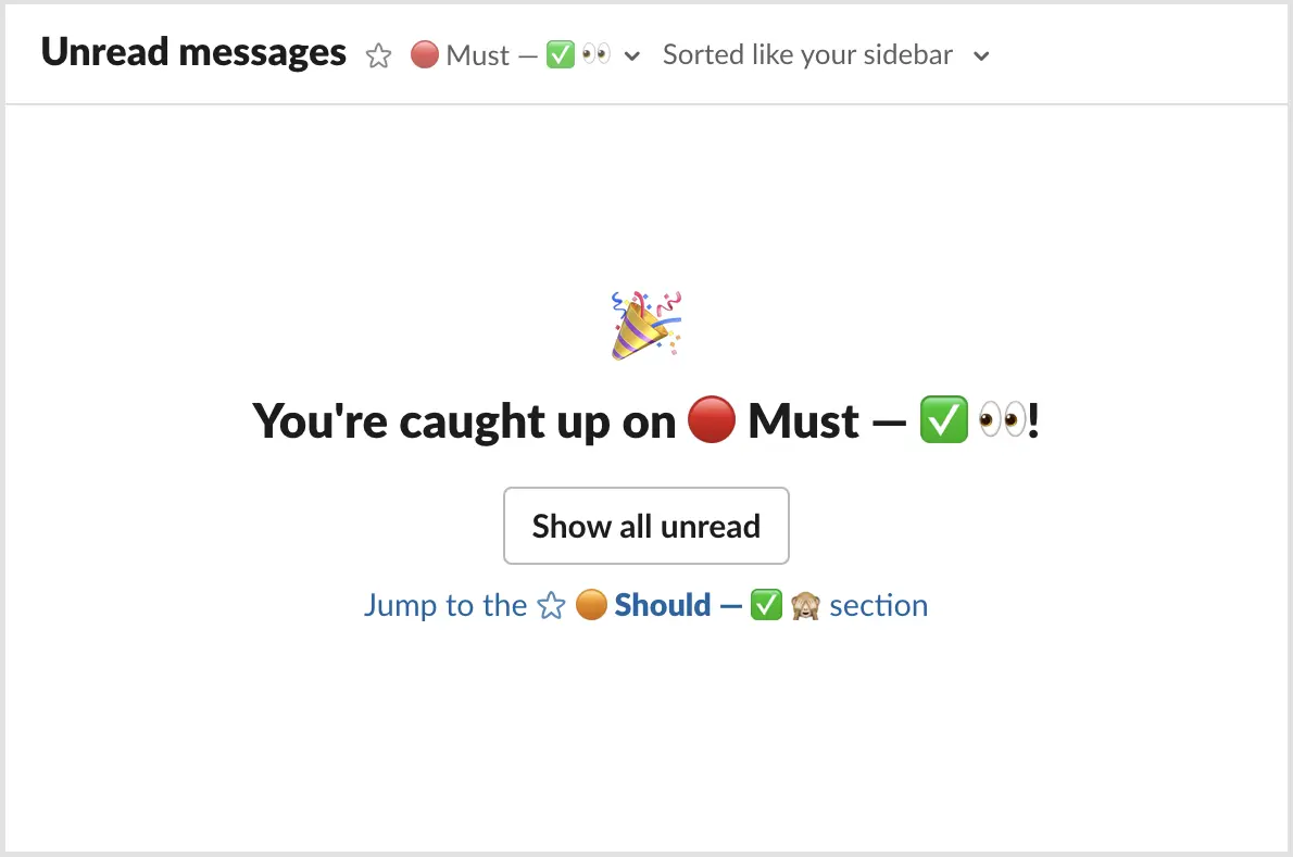
You can take advantage of the Unread messages sidebar item to speed up this process. See the Tips and tricks section below.
🚧 Full setup
The sidebar consists of the following sections, in this order:
- Starred default section
- Sorted Alphabetically and showing All channels
- Expanded all the time
- Contains conversations that I want to remain “pinned” on the top of the sidebar for a short time, regardless of read or not
- Used for ongoing group messages or temporary channels with an active conversation for a few days or so
- Direct messages of
@Slackbot(notices and some mentions) and my own user@me(for scratch notes) are always starred here
- Direct messages default section
- Sorted By most recent and showing channels with Unread messages only
- Expanded all the time
- Temp custom section
- Sorted By most recent and showing channels with Unread messages only
- Collapsed all the time
- Like temporary solutions tend to last forever, so the same happens with temporary channels
- This collects temporary channels so I can the person nagging to archive them when they’ve served their purpose
- I usually set a reminder on a relevant message as a trigger for when it’s time to archive
- 🔴 Must custom section
- Sorted By most recent and showing channels with Unread messages only
- Expanded all the time
- This section contains only the channels that are essential to my day-to-day work, as described above
- 🟠 🟢 🔵 🟡 ⚫️ the other custom section
- Sorted By most recent and showing channels with Unread messages only
- Collapsed most of the time
- The remaining less critical channels end up in these sections, as described above
- Channels default section
- Sorted Alphabetically and showing All channels
- Expanded all the time
- This section is usually empty
- Only temporarily, it can contain channels I’ve just joined and have not yet been sorted into their right section, as described above
- Apps default section
- Sorted Alphabetically and showing All channels
- Collapsed most of the time
- Easy access to apps I use on occasion but not so often that I remember their name
Information
💡 Tips and tricks
Navigation alternatives
With this approach, channels and conversations disappear from the sidebar once we read them. There are few options to navigate around and finding previous channels or conversations:
- Shortcut
CMD-Kto find and jump to a specific channel - History 🕒 view to go back to recent chats and last visited channels
- DMs view on the navigation bar to quickly get back to a group conversation
- Threads view, to see updates on conversations where I choose to Get notified about new replies
Sidebar “Unread messages”
You can take advantage of the sidebar Unread messages to process channels and messages in line with the sections concept shown above:
- Choose “Sorted like your sidebar”
- Display only the 🔴 Must section
- Once cleared, you can easily Jump to the 🟠 Should section
- … and so forth, until all sections are cleared one after the other
❓ Questions
Does it mean that with this you have Slack under control, almost empty, and you’re very responsive?
Of course not 🙂
Days still go haywire and messages backlog accumulates. And quite often it all becomes chaotic. That’s a consequent of the environments we work in.
With this setup though, I’m able to take care of the most urgent and important messages in those chaotic days. Also, it’s easier to recover from a crazy week without the fear of missing out (FOMO) some interesting message.
What about using sections to organise and classify channels by type, scope, urgency, category, etc.?
Before, I was using different sections to categorise and classify channels by themes, scope, etc. It was a way to scratch my itch for having everything well organised and in their “right” places.
I stopped doing it because it was getting hard for me to maintain them and was getting lost on too many places to check. There was no easy way to triage what was recent vs old and important vs secondary.
It was a hard to kill all those sections curated with much care, after lots of time invested. This was quite scary to do 😬 but the benefits and simplicity gained from switching to a setup optimised for processing new stuff have more than made up for it.
What about the mobile app “Newest to oldest” view?
This inbox approach started in the Slack mobile app. I switched my channels list to sort by “Newest to oldest” (previously called “Recent activity”). This lists updated channels under “Today”, “Yesterday”, and “Last 7 days” groupings.
This change was such huge improvement. I found myself switching from desktop to my smartphone to check Slack messages. I could focus only on the “Today” view and keep up-to-date with what was changing (even if there was some past backlog).
The only drawback was that there was no easy way to distinguish between important vs unimportant channels. Triage of what could wait for later in the “Today” section was only visual.
Shortly after, a colleague shared a similar “timeline” setup of their desktop sidebar. Inspired by it, I decided to take the plunge and experiment with this “Slack as an inbox” setup in both desktop and mobile.
Shared to…
🔒 (groups)