🔗 Atomic Design by Brad Frost

Atomic Design by Brad Frost Atomic Design details all that goes into creating and maintaining robust design systems, allowing you to roll out higher quality, more consistent UIs faster than ever before. This book introduces a methodology for thinking of our UIs as thoughtful hierarchies, discusses the qualities of effective pattern libraries, and showcases techniques to transform your team’s design and development workflow. Designing Systems Create design systems, not pages Atomic Design Methodology Atoms, molecules, organisms, templates, and pages Tools of the Trade Pattern Lab and the qualities of effective style guides The Atomic Workflow People, process, and making design systems happen Maintaining Design Systems Making design systems stand the test of time
13 January 2025 Â· 1 min Â· 113 words

🔗 Backlog size is inversely proportional to how often you talk to customers

Backlog size is inversely proportional to how often you talk to customers As with anything, these are not absolute truths but born out of my experience. Replace planning time with talking to customers Reduce time spent on UI design; focus on technical component design instead How you think people use your app is different than how they use it Implement account spoofing Page one real estate is critical to a seamless experience Your customer is your most important marketer MVPs are pointless if you’re not going to iterate on them There is no point to having a large backlog because the bigger the backlog, the higher the unvalidated assumptions, and the lower the chance that it creates any customer value. ...

24 January 2024 Â· 2 min Â· 286 words

🏞 (image)

“UI design starts with words.” (via How Do You Design Interaction? | Smashing Magazine )

28 July 2014 Â· 1 min Â· 15 words
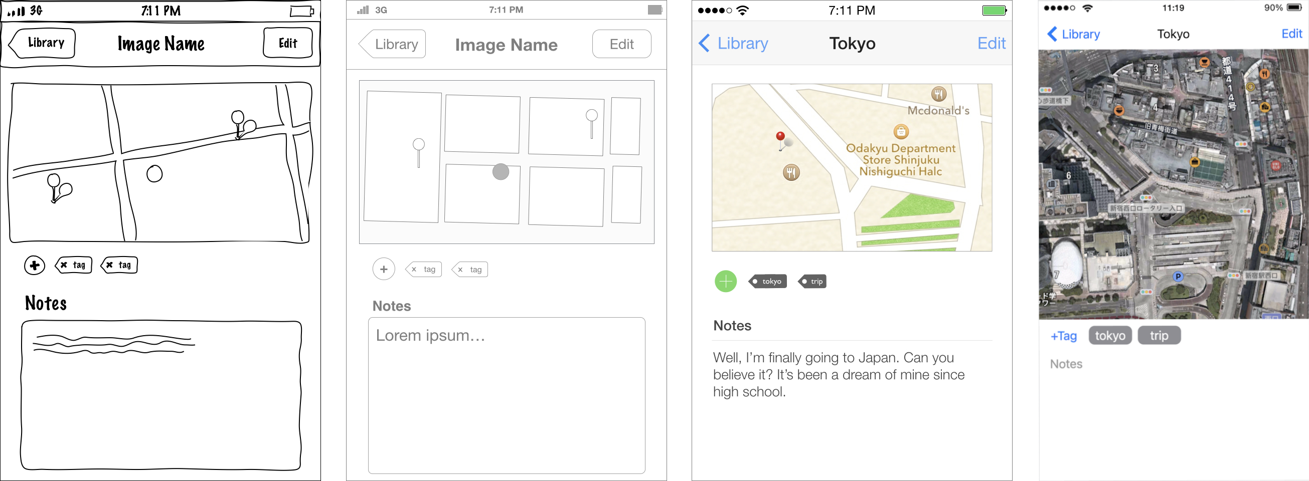
Examples of a sketch, wireframe and mockup, side by side

💭 UI/UX design artefacts

Compare and contrast different design artefacts (sketch, wireframe, mockup, and prototype) in terms of their fidelity, speed, cost and use cases.

27 March 2014 Â· 1 min Â· 134 words

🏞 (image)

(via Why It’s Important to Sketch Before You Wireframe – UX Movement ) Where by “Code” you should really read “Prototype”.

27 March 2014 Â· 1 min Â· 21 words

🏞 (image)

At Realmac we went this route with Ember, but we built in a slight twist. We try and guide the customer so they can get help or make a feature request rather than leaving a review on the App Store that we can’t respond to. If they are unhappy or confused we want to know about it and help them, if they are happy they can let us know and perhaps more importantly leave a review. ...

16 March 2014 Â· 1 min Â· 85 words

🔗 Origins of Common UI Symbols

Origins of Common UI Symbols They are road signs for your daily rituals — the instantly recognized symbols and icons you press, click and ogle countless times a day when you interact with your computer. But how much do you know about their origins? Power Command Bluetooth USB Play Pause Sleep At FireWire SBBOD (spinning beach ball of death) Ethernet See also The Secret Histories of Those @#$%ing Computer Symbols | Wired.com

16 January 2014 Â· 1 min Â· 72 words

🔗 The Highlight — Best of 2013: UI Animations — Beautiful Pixels

The Highlight — Best of 2013: UI Animations — Beautiful Pixels This year too, we’ve selected some fantastic apps in our list of The Highlight — UI Animations . See also for 2012 .

10 January 2014 Â· 1 min Â· 34 words

📺 The User is Drunk

The User is Drunk (by squareweave ) Blurry vision Attention-poor (Guide them) Say it twice Emotional (Do over the shoulder testing) Drunk, not dumb ( Source: https://www.youtube.com/ )

22 November 2013 Â· 1 min Â· 28 words

🏞 (image)

This tool was born from the daily toil of finding sample avatars for UI mockups (via User Inter Faces )

6 November 2013 Â· 1 min Â· 20 words

🔗 CAPPTIVATE.co

CAPPTIVATE.co Capptivate.co captures fleeting transitions between app screens and delightful animated UI elements that we’ll otherwise lose forever as apps and operating systems continue to evolve. Categories: Basic Motion Fade Grow or Shrink Motion Path Move or Slide Point At Spin or Rotate Camera Focus or Blur Frame Parallax Rotate Around or Sweep Zoom Simulations Align to Motion Attract or Repel Bounce Collide Ease Drift Gravity Orbit Around Spring Vortex

18 October 2013 Â· 1 min Â· 70 words

🏞 (image)

Why hollow icons are more work for your users and ultimately create cognitive fatigue. (via Hollow Icons — Design/UX — Medium )

27 August 2013 Â· 1 min Â· 22 words

🔗 Progressive Reduction

layervault: I’m very excited to talk about a technique that we’ve started using at LayerVault. We call it Progressive Reduction. (…) How does one guide a new user from on-boarding, to low proficiency, to high proficiency? With progressive reduction, the UI adapts to the user’s proficiency. (…) Your proficiency in a product will decay over time without usage. As such, the proficiency reflected in the UI decays over time. Essentially, your UI regresses without usage. ...

1 August 2013 Â· 1 min Â· 77 words

🏞 (image)

A Good User Interface has high conversion rates and is easy to use . In other words, it’s nice to both the business side as well as the people using it. Here is a running list of practical ideas to try out. (via GoodUI )

2 July 2013 Â· 1 min Â· 45 words

🔗 Starters Guide to iOS Design

Starters Guide to iOS Design (…) I find that many designers struggle with the transition to UI work, or with the different processes involved in iPhone and iPad app design. In this guide I’ll describe the deliverables you’ll be expected to produce, outline the constraints of the medium and introduce fundamental iOS and UI design concepts.

28 May 2013 Â· 1 min Â· 56 words